MS Whiteboard has added some great new features that have long been requested.
After the major updates to Microsoft’s Whiteboard last year, things have been ticking over with incremental updates to slowly improve things.
This year, Microsoft have completed another major change by changing the look of the Toolbars to make the tools more accessible when using interactive touchscreens. As well as that, there are other changes such as the Follow Me function, timers, and the new template creation tool to create and share templates with other people to work on independently of others.
Here we will list some of the major changes and highlight ideas to use them.
The Toolbar
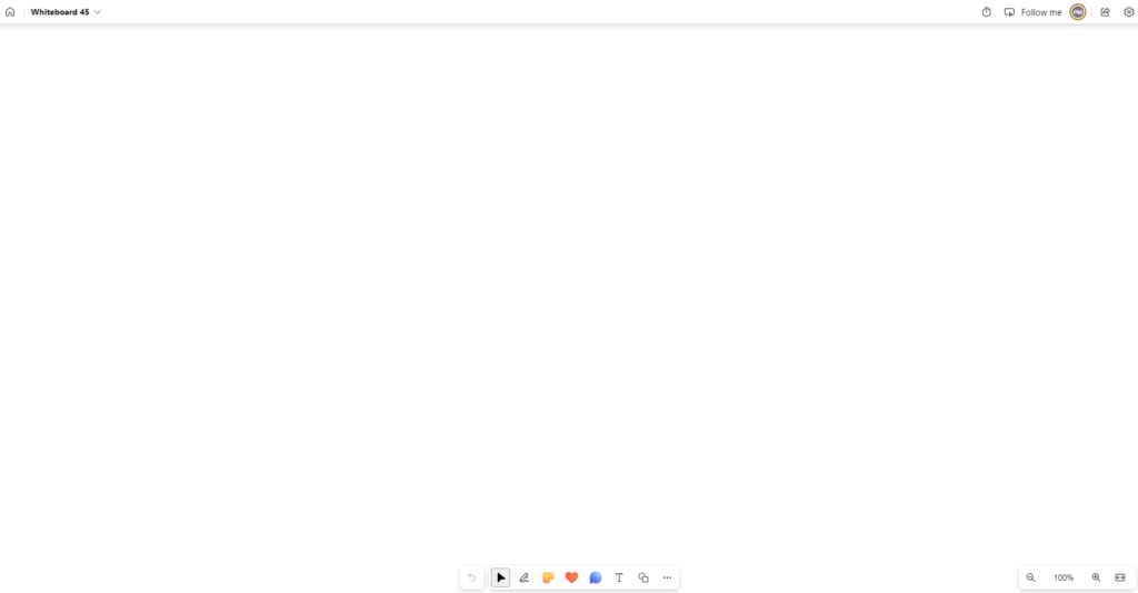
A much-requested feature was the ability to bring the toolbar to the bottom of the board to clear the space to make boarding easier as well as making the toolbar more accessible for students when using Whiteboard on an interactive screen. This makes it so much easier to use the pen tools for younger students without having teacher involvement to do so. Unfortunately, it is still fixed but it is an improvement for those who saw the previous location of the toolbar slightly perplexing.
Templates
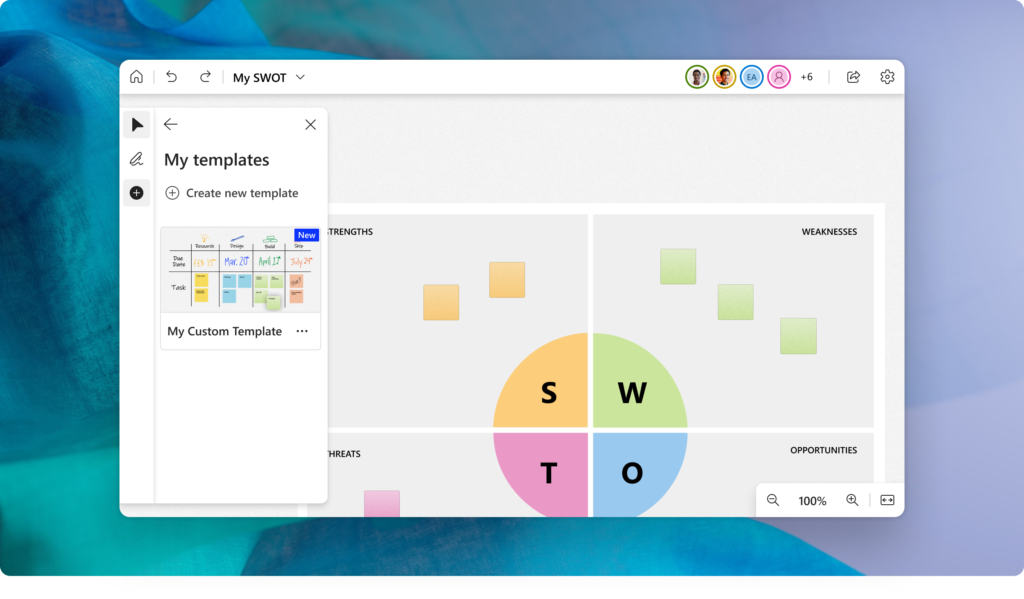
A frustration when using MS Whiteboard, was that it was difficult to share a board for users to work on independently of what others were doing. For example, a teaching team may have one staff member create a board to capture ideas on a lesson for use across the team. By sharing the board everyone with access will work on the board together meaning you will have other classes work on there when you may want to limit it to your class. Yes, you could use the copy and send feature using the whiteboard file in OneDrive, but this was a very tricky process that sometimes didn’t work as well as you would hope.
Thankfully, Microsoft brought in the ability to create, save, and share boards as templates meaning a commonly used board could be created as a template and sent to others to use in their own space. There are some limitations with what does get saved and shared in the template such as with YouTube links and some images, but for getting headings and formats that are re-useable across classes is a massive step forward.
Follow Me
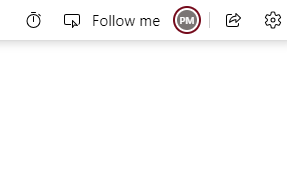
If you’ve ever been in a Teams meeting where the presenter shares a Whiteboard, you will know the pain of having to try and keep up when they navigate around the board, or if you get distracted and lose where you are. Microsoft have added a Follow Me feature into the board so that when you share the board with others, the board will move to follow the presenter as they do their thing.
When you click the Follow Me feature on it places a red border around the board to let you know it’s on and notes that participants are following you. When a participant drops out it notifies the presenter, and they can join back up by clicking the Follow button in the top right corner.
Finally, everyone can be in the same place, at the same time, unless they don’t want to be.

Timers
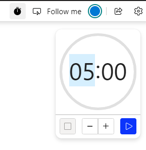
Another well requested function is for a timer on the board to give a countdown to hurry things along, or a reminder to finish up especially handy for online meetings.
The timer can be set for up to 60 minutes and once time is up gives a little times up picture in the top left, although handy, if you leave Whiteboard there is no other reminder to say it has finished.
Sharing
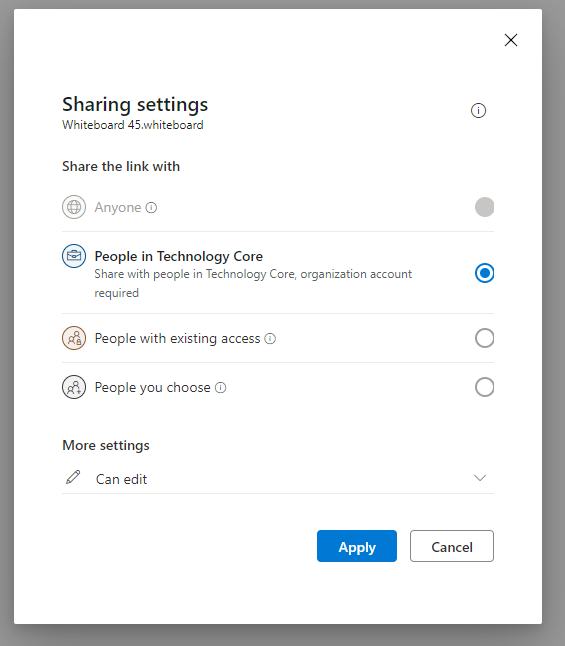
Previously, Whiteboard was limited to sharing within an organisation, i.e., anyone within the same company setup as the board creator. This has now changed to allow any people you choose inside or outside of a company by name, group or email address.
This makes Whiteboard much more flexible as people across multiple companies can now collaborate on a single board.
As Microsoft continues to update Whiteboard, there will be more great features that will be added and we’ll continue to note them for you.
Feel free to ask any questions below.


